The 3 Pillars of a Strong Donation Page
Request a Demo
Learn how top nonprofits use Classy to power their fundraising.
Collecting donations should be your website’s number one goal, and the design should make that task easy for people to accomplish. Not only do you have to guide potential supporters to your donation page, but you need to get them to complete the process, too.
This means that your donation form is the most critical stage of the giving experience.
Optimizing your donation form’s design is key to improving the donor experience. As the last step of the checkout process, your form can be game-changer for supporters who are deciding to make a gift. Not only can its design sway a donor’s decision to give, but it can also influence the level of their contribution.
Maximize your online donations by making sure your donation form has these three elements.
1. Simplicity
A long, overcomplicated donation process is bound to work against you. Make sure your checkout process is as simple and easy as possible by doing two things:
• Keep your form short and sweet. Whatever you do, don’t send your donor through four different screens to complete their gift. A multi-step process like this will only annoy them and lower their chances of actually making it to that donate button. Make sure your form is short and easy to fill out. It’s best to keep the entire form to one screen, and just ask for the donor’s most important information: their name, billing information, and email address.
• Eliminate distractions. You have one goal: to keep your visitors on the page and make sure they hit “donate.” When you add extra links to your form, you give donors the chance to click away and ditch the checkout process altogether. Prevent this by removing any distractions or external links that will serve as exit signs off your page.
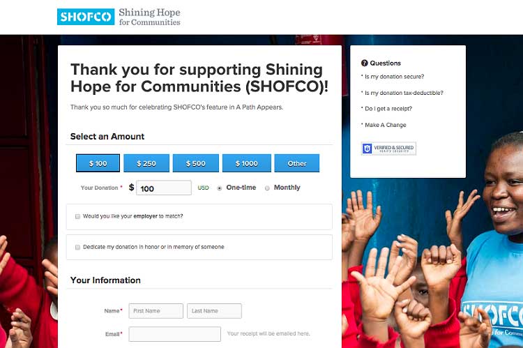
Take this example from Shining Hope for Communities. Using Classy, the organization is able to eliminate extraneous links from their donation page. The top header includes nothing but SHOFCO’s logo, increasing donors’ chances of staying on the page and finishing what they started.
2. Branding
A branded checkout form improves the giving experience so much that it can boost your overall online donations. Donors give 38 percent larger gifts to branded donation pages than to generic pages. On the whole, branded donation pages raise six times the amount that generic pages do.
When people hit your donation page, they should be able to immediately recognize that it’s associated with your organization. Make sure your form reflects your nonprofit’s branding, messaging, and imagery to eliminate any reasons for donors to second-guess their gift.
Pro Tip: Your website’s main donation page should be branded, but it’s also a good idea to create custom donation pages for specific campaigns. When you ask donors to support a specific campaign, link the appeal to a branded donation form that matches the look and feel of the appeal. Carrying over the campaign-specific messaging and images onto your donation form will sustain the emotional momentum that moved people to donate to your campaign in the first place. It also assures donors that their gifts are going to the campaign they plan to support.
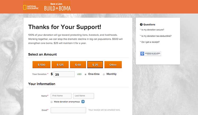
Check out this custom donation form that National Geographic created for their Build A Boma campaign. There’s no doubt where donations will go.
3. Choices
When it comes to making purchases and transactions, people inevitably make choices about how and what they want to purchase. But successful marketing isn’t about offering a ton of options to choose from. It’s about offering smart choices.
There are three main areas on your donation form that require some thought:
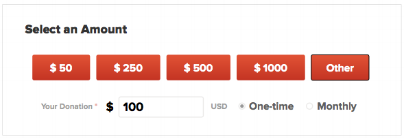
• Giving levels: Your donors need to choose how much to give, and you can steer them along by suggesting specific donation amounts. These will depend on your organization and the audience being directed to this particular donation form. Consider offering three or four suggested giving levels along with the option to type in a custom amount. Select a couple of levels that reflect what your average donor contributes, as well as a few that push this donation size higher.
• Frequency: Always include the option to give either a one-time gift or monthly donation. Make this an easy opportunity for people to opt into your recurring giving program.
• Personal Interests: In order to effectively communicate with your donors, you need to understand who they are and how they’re connected to your cause. Fortunately, your donation form can help you learn more about your donors and their motivations for giving.
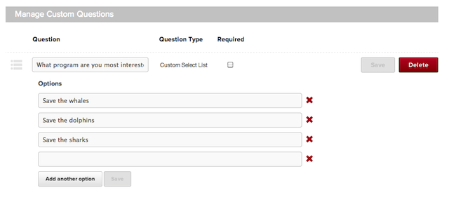
With Classy’s fundraising software, you can add custom questions to your checkout page so donors can share why they gave to your cause. Remember to keep it simple and choose one or two questions that will give you the most information. One option might be to provide a drop-down list for donors to choose which program they’re passionate about.
Your follow-up email can then touch on this specific program. This allows you to craft more personalized, meaningful messages for your donors.
Your donation form is one of the most important pages of your website. It can mean the difference between receiving a generous donation and leaving support on the table. Make sure your donation form exhibits these three components in order to maximize your online donations.
Read Next: How to Boost Engagement on Your Donation PageThe Science of Fundraising is at your Fingertips

Photo credit: flickr user frankieleon
Subscribe to the Classy Blog
Get the latest fundraising tips, trends, and ideas in your inbox.
Thank you for subscribing
You signed up for emails from Classy


Request a Demo
Learn how top nonprofits use Classy to power their fundraising.