10 Giving Tuesday Landing Page Upgrades to Boost Conversions

Your Giving Tuesday landing page is a gateway to year-end support and the lead-in to a successful giving season. However, just creating a page isn’t enough to cross off of your Giving Tuesday checklist.
With the potential to convert donors, raise donations, and introduce future advocates to your cause, your landing page is arguably the most important asset to your fundraising efforts during the giving season. It’s where you direct all your social media followers, email subscribers, and blog readers to take action. Get it right, and you’ll open the door to donor support. Get it wrong, and you might turn off potential donors.
Fortunately, optimizing your Giving Tuesday landing page is doable with a little guidance and the right technology. Below, we’ll walk you through 10 ways to upgrade your Giving Tuesday landing page to offer an elevated user experience, drive higher conversion rates, and meet your fundraising goals.
Explore Classy’s Free Giving Tuesday Resource Center
Why Every Tweak to Your Giving Tuesday Landing Page Counts
First, let’s get on the same page about why this all matters.
Everything from your headlines to your visuals to your call to action (CTA) buttons impact your visitors’ decision to donate. Some would-be supporters need a bit of social proof and credibility to earn their donations, while others only want a simple user interface to get in and out quickly.
Even the smallest tweaks can make a huge difference to your conversion rates. Here are a few examples:
- DMIx found that conversions jumped by 34% with a red button versus a green button for the CTA.¹
- Michael Aagaard moved his CTA button from the top of a landing page to the bottom and saw a 304% increase in conversions.²
- PartnerStack boosted its conversion rate by 111% by tweaking its CTA from “Book a Demo” to “Get Started.”³
These statistics are not one size fits all but demonstrate the power of refining your conversion opportunities once you identify what works best for your audience. If you apply this same strategy to your Giving Tuesday donation landing pages, you’re in a prime position for conversions.
10 Giving Tuesday Landing Page Optimizations to Put Into Practice
Here, we’ll offer 10 optimizations, but you don’t have to do everything today. Instead, find a handful of tips that resonate with you most and test them on your landing page. Then, move on to the next set. Making small changes now will give you time to test what works (and what doesn’t) to replicate your success come November.
1. Nail the Must-Have Elements
We talked to our customer success management team at Classy about how to design a top-notch Giving Tuesday landing page. Here are a few must-have elements we sourced from standout Giving Tuesday campaign examples:
- Appeal section: Maximize conversions and capture potential new donors’ interest by strengthening your campaign appeal. Include vivid storytelling attached to tangible outcomes of what each donation will accomplish. Then, turn on a recurring donations option directly beside or underneath your appeal to inspire donors to subscribe.
- Frequently asked questions: Answer questions you know your donors will have proactively. Consider questions asked last year or those you’ve heard in recent donor touchpoints.
- Pre-set donation suggestions: Implement suggested donation amounts to simplify the giving process, improve the user experience, and guide donors toward more impactful contributions. We’re so passionate about the value here that we’re currently working on creating personalized, machine learning-enabled ask amounts in partnership with GoFundMe. This will go beyond simple matches to ZIP code or wealth data and instead collect deep understandings based on the causes a donor supports, giving history, and historical conversion rates. For updates on our progress, subscribe to our emails.
- Limited custom questions: Eliminate unnecessary custom questions (or make them optional) to improve completion rates.
- Donor-covered fees: Enable and set Donor Covered Fees to default for your campaigns on Classy’s fundraising platform. When preselected on Classy campaigns, roughly 85% of donors choose to cover the fees. That’s a huge savings for your nonprofit.
- Donate button: Create unique, short, compelling, and action-oriented CTAs for your donation buttons.
2. Draw Donors in With a Compelling Headline
Your headline might be prospective donors’ first impression of your brand. Use this to entice them with an attention-grabbing title to have a chance at scoring their contribution.
Here are some things to consider when crafting your headline:
- Attention: Say something powerful enough to make donors pause and linger on your page.
- Purpose: Communicate your mission and why it matters clearly.
- Connection: Create an immediate emotional connection to your cause with words that resonate.
- Tone: Stick with a cohesive tone throughout your headline and remaining copy, whether heartwarming, urgent, inspiring, or heroic.
- Trust: Build credibility and establish your nonprofit organization as reliable and impactful by leveraging the right voice.
- Differentiator: Illustrate what makes this campaign unique from past campaigns.
3. Keep It Short and Sweet
Even though there’s probably a lot you want to say, do your best to limit the fluff and keep things concise. You want visitors to take action and donate—not necessarily read an e-book.
Keep the page focused on a compelling message and a clear CTA. You’ll also want to be intentional with your copy and try to only include relevant details that connect to your narrative.
4. Make the Impact Clear
It’s also crucial to spotlight what each donation helps accomplish. Instead of saying, “Your donations help us accomplish our mission,” emphasize what the mission is with something like, “Every $50 donation feeds a starving child for one month.”
5. Establish Authentic Connections Through Storytelling
Storytelling helps bring your nonprofit’s mission and vision to life. In the modern saturated digital landscape, it’s becoming increasingly challenging for supporters to establish authentic connections with charitable causes. Only when deployed effectively, can people relate their personal experiences to those supporting or benefiting from your work.
Effective storytelling evokes:
- Engagement: Share stories that resonate with donors so they become more emotionally invested in your cause and, therefore, more likely to volunteer to become a part of the solution.
- Empathy: Include personal narratives to help donors relate to the experiences of beneficiaries or those impacted by your organization’s work.
- Memorability: Tug at people’s heartstrings with stories that resonate. Incorporating memorability into your Giving Tuesday messaging strategy is a powerful way to establish your cause as a priority in donors’ minds.
- Uniqueness: Demonstrate how your solution to the problem is different to motivate charitable giving. Nonprofits work collectively to support meaningful missions worldwide, but your stories are unique to you.
6. Communicate One Simple CTA
The goal of your Giving Tuesday landing page is to make it as clear and compelling as possible for people to donate to your cause. How you frame that CTA is entirely up to you, but the takeaway should be immediately apparent when users land on your site.
Tell your supporters exactly what you want them to do with action verbs like:
- Donate Now
- Save a Child
- Support Our Cause
- Give a Meal
- Change a Life
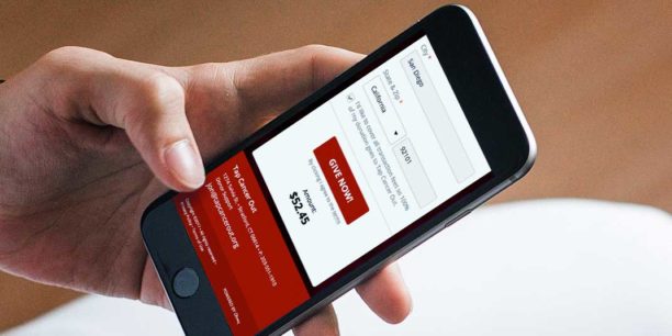
7. Make It Easy to Give Anywhere, Anytime
According to Classy’s State of Modern Philanthropy report, in most cases, mobile devices override desktops, and the donors who use mobile often find causes through social media. Mobile responsiveness can’t be an afterthought—it must be the priority. Here are a few things to consider with mobile:
- Responsive layout: Use responsive design techniques to adapt your landing page’s layout and elements to any device’s screen size.
- Font size: Choose font sizes that follow accessibility best practices for mobile visitors to explore your page easily.
- Images: Compress your images to improve page loading speed.
- Scrolling: Use jump links throughout your landing page to help visitors jump to a section or skip straight to your donation form quickly. This reduces the amount of scrolling users need to do.
Another way to enhance the user experience is through embedded donation forms. Embedding your donation form on your landing pages means your visitors have one less click (if not more) to complete the donation process.
Learn how you can use Classy’s embedded checkout solution to plug forms wherever you like to streamline donations.
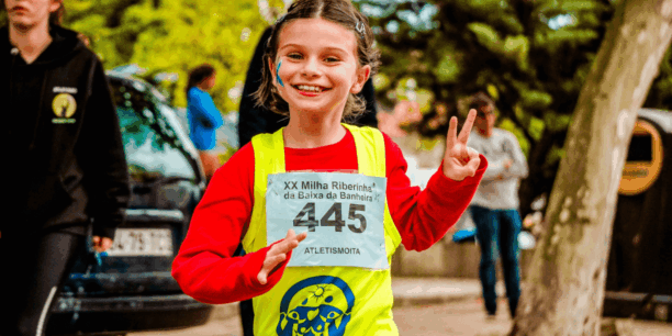
8. Use High-Quality Images and Videos
Images and videos offer a compelling storytelling component to your campaigns and can help increase donors’ trust in your organization. Choose relevant visuals, such as photos of beneficiaries, impactful statistics, and graphics that reinforce the benefits of donating to your Giving Tuesday campaign.
Just be sure to focus on quality over quantity. You don’t need dozens of visuals across your landing page. Instead, focus on the best of the best.
9. Build a Sense of Urgency
Urgency helps nudge your would-be donors across the finish line. Here are a few ways you can create that sense of immediacy on your page:
- Countdown timer: Display a live countdown timer ticking toward Giving Tuesday.
- Exclusive offers: Offer limited-time incentives to early donors.
- Real-time donor counter: Show a live donor counter that updates with each new supporter.
- Language: Use powerful language like “Act Now,” “Last Chance,” or “Time Is Running Out.”
10. Add a Donation Match Option to Your Form
Donors don’t always consider (or remember) employer matching. Sometimes, it only takes a quick reminder and some encouragement to increase (or double) your donations.
Classy has a built-in integration with Double the Donation to allow donors to quickly check their companies’ matching guidelines and complete a matching gift request.
It’s a seamless way to double your donations with less than half the effort.
Build Better Donation Sites With Classy
Classy’s online fundraising platform provides all the features you need to build a robust, captivating Giving Tuesday donation site. Here’s a sample of what you can create with Classy:
- Custom-branded campaign pages with images, videos, progress bars, impact blocks, and more reflecting your unique mission.
- Donation forms with one-time and recurring giving options and preset suggested donation amounts.
- Flexible payment options through Classy’s in-house payment solution, Classy Pay, allow donors to give through credit cards, ACH, PayPal, Venmo, cryptocurrency, and more.
Want to see a Classy donation page in action? Request a demo to chat with an expert.
Copy Editor: Ayanna Julien
Article Sources
- “Which CTA Button Color Converts the Best?” All Things Data-Driven Marketing, CXL, last modified April 22, 2021, https://cxl.com/blog/which-color-converts-the-best/#h-green-vs-red-a-call-to-action-button-war.
- “Above the Fold vs. Below the Fold: How to Encourage Scrolling (and Converting),” All Things Data-Driven Marketing, CXL, last modified September 2, 2021, https://cxl.com/blog/above-the-fold/.
- “15 Call-to-Action Statistics You Need to Know About to Increase Your Conversion Rate,” HubSpot, last modified July 14, 2023, https://blog.hubspot.com/marketing/personalized-calls-to-action-convert-better-data.

Explore Classy's Giving Tuesday Resource Hub