5 Killer Photography Tips for Nonprofit Brands

Request a Demo
Learn how top nonprofits use Classy to power their fundraising.
As content marketing continues to grow in popularity, more and more nonprofits are using visual content to attract and engage supporters. Photos and graphics tell your organization’s story in a way that text alone cannot.
But you shouldn’t use just any sort of image in your communications. You have to use high-quality, eye-catching photos that represent your nonprofit brand. By being thoughtful in the way you edit and position your images, you can improve your chances of making a great impression on a supporter and communicating your message.
We teamed up with one of Classy’s designer, Stacey Uy, to bring you five best practices to resize, crop, and arrange images in your communications.
1. Prioritize High-Resolution Photos
The quality of your images instantly affects how site visitors perceive your nonprofit brand and story. That’s why you should always make resolution your number one priority.
Resolution refers to the fineness of detail in your image, and it’s measured in pixels per inch (ppi). The more pixels per inch, the greater the resolution, and the sharper your image. High quality images speak volumes about the caliber and professionalism of your organization. Likewise, low-quality, pixelated images can make your organization’s website look haphazard and unattractive.

Stacey Uy
Designer, Classy
When resizing images, keep in mind that images scale gracefully from large to small, but not the other way around. You can size down a large, high-resolution photo while maintaining its quality, but as a small image gets larger, the resolution decreases. This is why it’s important to obtain original images at the largest resolution possible. You can simply size down your photo if needed and maintain its quality.
2. Avoid Using Tiny Images
Along with its quality, an image’s size can also affect the way your nonprofit brand’s story comes across. Size refers to an image’s height and width. When a site visitor hits your page, a large, memorable photo can instantly capture their attention and pull them into the page. Tiny images sprinkled across your page, on the other hand, can fail to make as big of an impact. Emphasize your compelling images to attract and keep people on the page longer.
One thing that limits creativity with images is the outdated 960px-wide layout with a sidebar. It leaves little real estate for images and text side by side. With today’s advancements in do-it-yourself web design, it has become easier to incorporate more modern templates with full-width images, and replace the typical sidebar with top-fixed navigations.
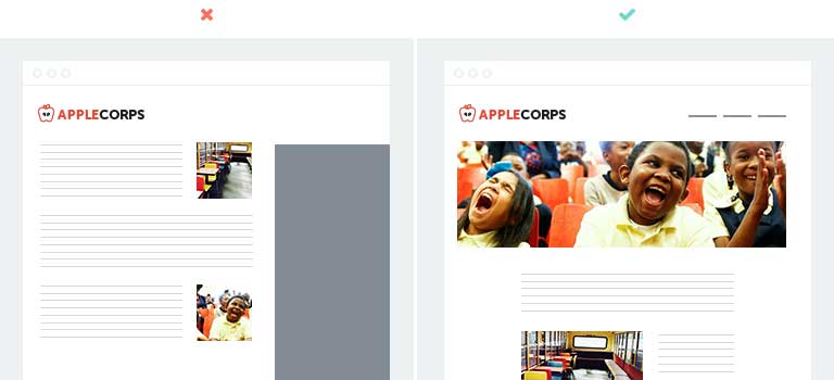
The photos on your page are just as important to telling your story as the words are, if not more. As a rule of thumb, try to keep photos more than 40% of the page width, and reserve thumbnail-sized images only for individual headshots.
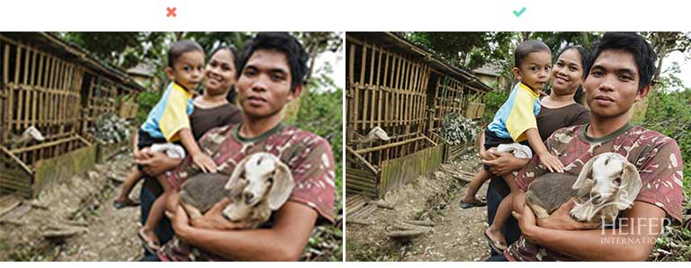
3. Use the Rule of Thirds When Cropping
Use the rule of thirds to improve the composition and balance of your images. Because the human eye tends to be more drawn to images divided into thirds, place the main subjects of your image along these divisions or their intersections.
Before you crop or edit your photo, visualize the frame as a tic-tac-toe grid with two vertical and two horizontal lines, dividing the image into nine equal parts. Rather than simply centering your main subject, increase visual interest by placing it at an intersection or along the one of the lines.
The following image is cropped so that the focus lands on one of the four intersections on the grid. Because all photographs tell different stories, it can be difficult sometimes to identify what the focus of an image should be. This photo emphasizes the relationship between the two women by focusing on the central line between them.
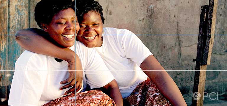
When dealing with people in a photo, position their eyes to fall on the intersection points, if possible. Eyes are the most expressive part of a person’s face, and humans are naturally drawn to them. Placing them on these focal points allows the viewer to capture the emotion in the photo.
4. Leave White Space Around Your Subject
The empty space in your image can be just as important as your main subject. The term “white space,” also known as negative or blank space, refers to the space between or surrounding your main subjects in a photo. It’s a key element of good design and photography, as it defines and emphasizes the main subjects in your composition. It draws the eye right to your subject, and it also prevents your photo from appearing too crowded.
When cropping your photos, leave some white space around your subject. Think of it as giving your subject some “breathing room.” In fact, don’t be afraid of leaving lots of background space in your photo. It can give your viewer a sense of the environment and context in which your photo was taken. When used thoughtfully, it can create a more dynamic composition that evokes stronger emotions.
White space, or the background of your image, can be used as a storytelling tool. Include the space that your subjects are looking at or interacting with in the photo to carry the narrative forward. This also makes it easier for the viewer to imagine themselves in the photo with your subjects.

Take this example from Generosity.org. They dedicate a large portion of the photo to the basin of water that the kids are reaching into. Not only does this emphasize a core part of Generosity.org’s mission, but it also gives the viewer context as to what the kids are doing.
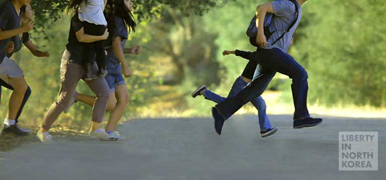
5. Do Something Unexpected
While there are a number of composition techniques and principles, don’t feel limited to them by any means. They’re not hard and fast rules; they are simply guidelines to help enhance your image. Don’t be afraid to get creative.
If you’re just starting out, breaking the rules can be a little scary, and sticking to the above concepts is your safest bet. But keep in mind that photography is really all about getting creative and experimenting.
If you feel comfortable, try doing something unexpected. Faces in images are key, but Liberty in North Korea decided to crop out most of the subjects faces in this image. This way, the viewer relates more to the sense of urgency and struggle that refugees face.
Investing more time and thought into your online images can greatly influence someone’s perception of your nonprofit’s brand, professionalism, and story. Use quality, compelling photos on your website and blog that move potential supporters to action.
Every Campaign. Every Channel. #Winning

Subscribe to the Classy Blog
Get the latest fundraising tips, trends, and ideas in your inbox.
Thank you for subscribing
You signed up for emails from Classy


Request a Demo
Learn how top nonprofits use Classy to power their fundraising.