The Psychology of Color: Design for Nonprofits
Request a Demo
Learn how top nonprofits use Classy to power their fundraising.
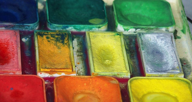
By now, the point has definitely been hammered home: on the Internet, design matters. We’ve outlined and recorded how to get started with great web design for nonprofits, but one topic we haven’t addressed is color. Do the colors you choose for your website, or the branding of a particular campaign, affect giving to your organization?
In short, they can. Implementing color theory into your design and marketing may take a little time and creativity, but the benefits just might be worth the extra effort.
Create A Brand Association That Matches Your Mission.
“Color is not just about aesthetics – it also communicates specific information.”
Our associations to color are learned, cultural and biological. By being in tune with who you are trying to reach (more on this momentarily) and, by making a strong connection between what you do and your organization’s branding (both design and color), you can reinforce your identity on a subconscious level. Essentially, when your visual messaging matches your mission, you are able to strengthen brand association and reinforce trust.
The Logo Co has done a great job of delineating some standard Western emotional and physical associations with color, as shown in the chart below or in more detail here. Take a look through to see if your current branding matches up with the emotional message you want to be conveying.

Color Preference Isn’t Universal.
In the past, we’ve talked a lot about the importance of segmenting your e-mail lists, as well as the importance of customizing donation amounts, appeal copy, and calls to action. If you want to kick your segmentation and customization up a notch, you can add design to the list. Tweaking visual elements like color may improve click through rates for different groups. From personality traits to gender, there has been a good amount of research into the color preferences of particular groups as it relates to marketing. Creating visual elements that are targeted to each segment of your list, may help you increase the ROI from your next appeal.
“Some color associations may emerge from learning alone, but color theorists suspect that many such associations emerge from evolutionarily ingrained responses to color stimuli.”
It has been documented that purple is popular among women and blue is popular among men. Research like this can only help nudge you in the right direction when testing out different designs. While some of these findings might be worth testing out in your upcoming appeals, they’re not hard and fast rules. Color theory acts like a nightlight in a dark room, it may help you understand the rough outlines, but it won’t illuminate the whole picture. Ultimately, if you want to put the effort into this level of segmentation, you need to A/B test different designs and respect what the numbers tell you.
Color or Contrast?
A few groups have done case studies on whether red buttons generate better click rates than green ones. As it turns out, those studies showed that red did increase the click rates in most cases. It appears, however, that this was because red stood out more on the page. In other words, if a page has mainly green elements, a green button would do worse than a red one. The “isolation effect” predicts that if something sticks out from the norm it’ll be more memorable. As you are testing out colors for your appeals and calls to action, keep in mind that it’s not just about which colors you choose. It’s also important that those colors will actually stand out from the rest of your design.
Sessions, a design college, has a great online “color calculator” that can help you choose contrasting, or complimenting, colors.
At the end of the day, while it’s not everything, color definitely matters. Taking a calculated approach to choosing a color palette and testing results is a great place to start. You never know, it just might be the missing piece you’ve been looking for to increase your online engagement!
Have an Idea for a Fundraising Campaign?

Subscribe to the Classy Blog
Get the latest fundraising tips, trends, and ideas in your inbox.
Thank you for subscribing
You signed up for emails from Classy


Request a Demo
Learn how top nonprofits use Classy to power their fundraising.