6 Best Nonprofit Websites to Inspire Your Campaigns

Your nonprofit website is the face of your mission and an opportunity to make a first impression that leads visitors to take action to support your cause.
Classy’s annual donor trends report, Why America Gives, showed us that 60% of donors visit a nonprofit’s website to do research before making a donation or fundraising on a charitable organization’s behalf. How can you be sure your website moves supporters, partners, board members, and potential employees to act?
Below we dissect six of the best nonprofit website examples and what makes them shine.
Anatomy of a Great Nonprofit Website
Let’s start with a breakdown of what makes a nonprofit website stand apart.
Make an Impression
User experience is everything. Picture a curious internet browser looking to learn more about climate change or a passionate supporter clicking on your site from an Instagram story their friend shared about your new program.
Nonprofit website visitors can come from anywhere, on any platform, browser, or device. Thinking about the many paths to arrive on your homepage helps you craft an experience that’s smooth for everyone. One extra click or confusing call to action (CTA) can be enough to send someone looking elsewhere. That’s why the details, such as button colors and font, make a big difference.
Also, consider the website content and visuals that greet people:
- What are the first things they see and read?
- Is it immediately clear what you do?
- Can users understand why they should be a part of your mission?
Your website is the place to use the best infographics, videos, images, and design elements you have available.
Tell Your Story
It’s time to tell your story in the most authentic and relatable way to showcase why your mission exists and the impact it makes.
Everything from your homepage to your “About” sections and program overviews should feel consistent to ensure easy navigation and the best user experience overall.
Even the most beautifully written webpage can go unread if it’s too overwhelming. Think about the most critical information on each page, then lean into typography and styling that draws the eye to one heading or section at a time.
According to social scientist Kevin Schulman, every story needs the following ingredients:
- Speed
- Volatility
- Volume
- Circuitousness
It also needs to be authentic and personalized to the audience.
The good news is that everyone has a story. Unfortunately, we often forget writing is technical, and to communicate to inspire action, we need to learn and implement those technicalities.
Provide a Clear Call to Action
Now that you’ve hooked your visitors to learn more, create a feeling of connection and purpose within them. One of the most critical pieces of a successful nonprofit website is a clear path to take action on those feelings through:
- Donating
- Volunteering
- Fundraising
- Attending upcoming events
- Highlighting your work on social media
Every webpage should include unique CTAs that are clear and relevant to what comes before them. It begins with a primary CTA on your homepage to capture interest quickly and direct visitors where you want them to go. To do this, we recommend placing a vibrant donate button in the top-right corner of your site.
For many nonprofit organizations, these CTAs will direct visitors to a streamlined online donation form or timely donation website. For anyone not ready to take action, be sure to include social media links and contact information to keep them in the loop.
See Donation Button Best PracticesLearn from 6 Nonprofit Website Examples
Now that you know the anatomy of a great nonprofit website, these six examples show you what it looks like when it all comes together.
1. The Sarara Foundation
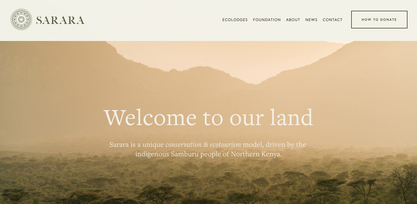
The Sarara Foundation’s minimalist color scheme and calming web design bring its story to life and drive supporters to join the community.
Make an Impression
Site visitors land on a simple visual complemented by impactful language to welcome them. The language is thoughtful and descriptive while remaining concise enough to scroll through and keep people wanting to learn more.
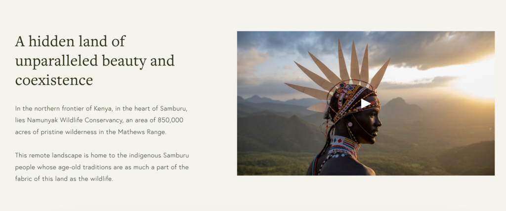
Tell the story
A clear “Our Story” section of the website navigation menu pulls on visitor curiosity. Within this tab, users are encouraged to watch a video that immerses them in The Sarara Foundation’s story and other educational resources.
A beautiful mixture of text and visuals follow the initial impression to teach potential supporters about the organization’s work to preserve large tracts of biodiversity that, in turn, create prosperity and opportunity for indigenous communities. The nonprofit website design remains consistent with every other page a visitor may explore.
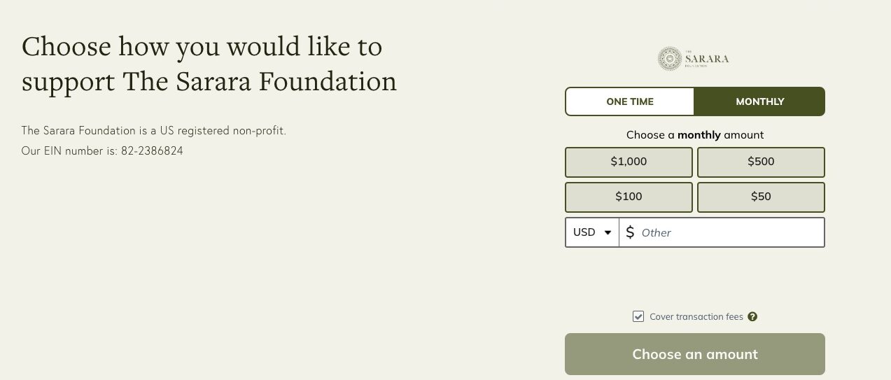
Provide a clear call to action
From anywhere on the website, visitors can see a clear How to Donate button that leads them to a page where an embedded, flexible donation form is ready to use. Interested supporters can complete an impactful one-time donation based on suggested donation amounts or start a recurring donation with the organization to strengthen their impact in a matter of clicks.
Did You Know? Classy customers who enable embedded donation forms routinely see donation conversion rates twice the industry average.
2. Just One International
Just One International presents a website example full of color and creative visuals to share its mission and attract new donors.
Make an Impression
The first thing visitors see on this organization’s website is a thoughtfully arranged display of images they can connect with and grow curious about supporting through various community-oriented programs.
Tell the story
Once users enter the page, they can continue immersing themselves in the inspiring stories of those who benefit from Just One International’s work. The bold header and intentional white space draw the eye to keywords and programs the nonprofit organization hopes to highlight.
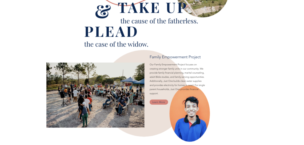
Provide a clear call to action
Just as visitors begin to see what Just One International is all about, they discover several ways to take action based on their intent. Supporters can dive right into becoming a sponsor, making a team donation, or choosing to follow along on social media or through its nonprofit newsletter. With so many options, there’s more opportunity for people to continue their experience with the organization at a pace most comfortable for them.

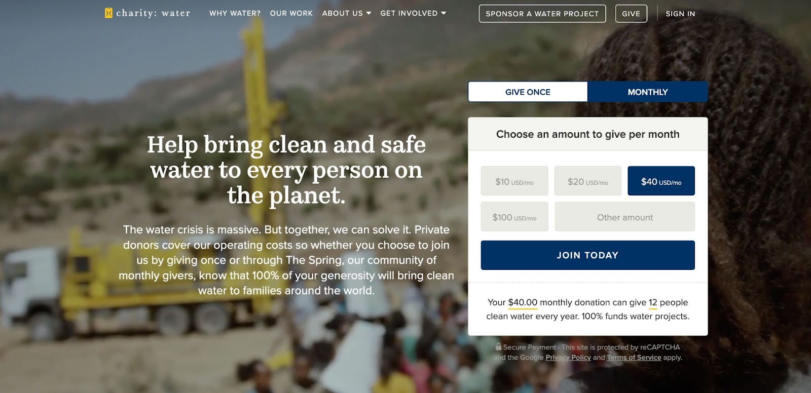
3. charity: water
Charity: water’s website appeals to anyone stopping by for the first time or returning to give again, regardless of the device they use to get there.
Make an Impression
From the first page, visitors see a powerful image, a clear explanation of the organization’s impact, and a donation form to contribute. The website is also mobile-friendly, so supporters can find what they need within a few scrolls.
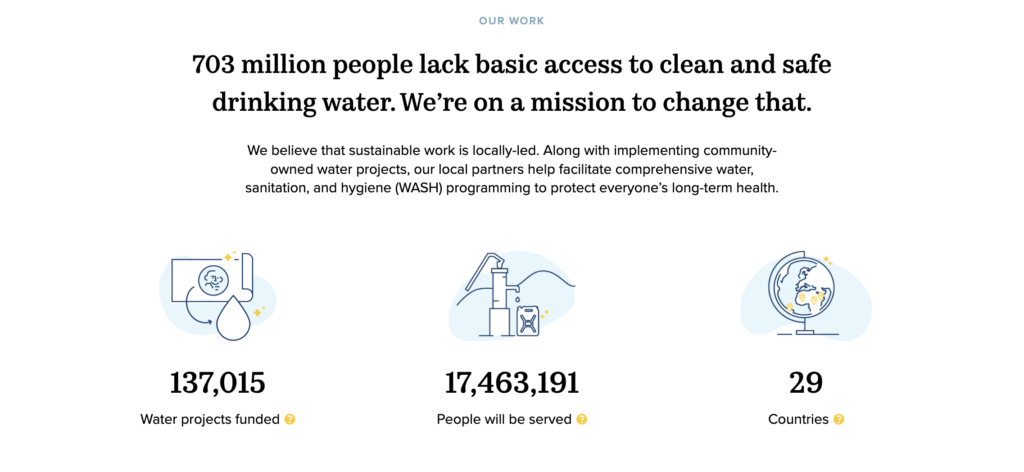
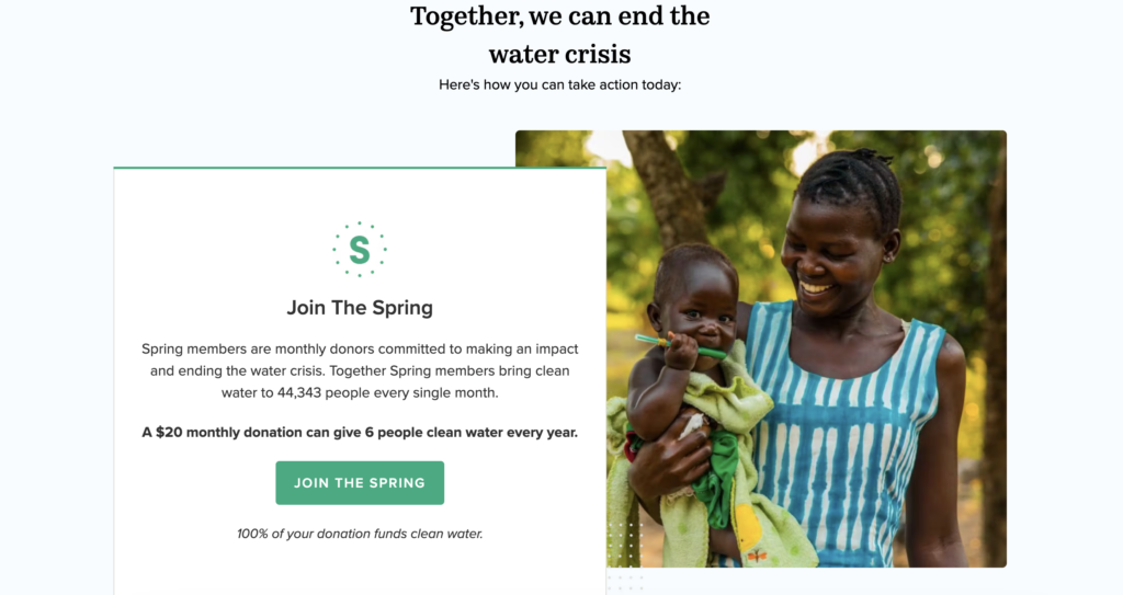
Tell the story
Beyond the first impression, charity: water gives website visitors substantial numbers to quantify its efforts and explain the meaning behind its many projects to support clean water. Among the many clean water organizations, charity: water tells its story through the beneficiaries and outcomes built around its mission and shares that in an eye-catching infographic.
Provide a clear call to action
From the first impression to the main donation site, supporters are always seconds away from completing a donation. They also have many options to get involved through a monthly donation program, corporate sponsorship for special projects, cryptocurrency donations, and more. A wide array of subsequent possible actions meets any potential donor where they are.
4. Second Harvest Madison
Second Harvest Madison’s website is a standout example of balancing bold visuals, powerful storytelling, and a humanistic feel.
Make an Impression
Visitors can understand what Second Harvest Madison is about in seconds, followed by bold text that speaks to the nonprofit mission statement in two strong words: “Nourish First.” Donation buttons in red attract attention quickly and draw interest.
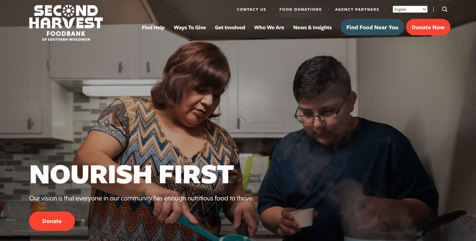
Tell the story
The story continues with a proud display of the organization’s impact through its work as a community food bank. Confident and assertive language tells visitors they found an organization they can count on to produce a significant impact as they grow more intrigued by the opportunity to participate.

Provide a clear call to action
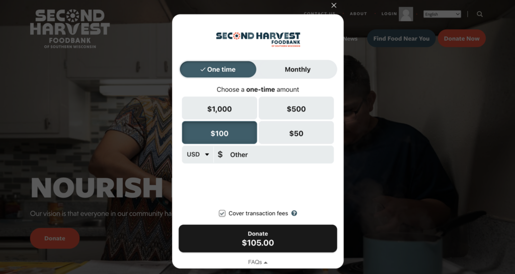
Various payment offerings allow donors to choose their preferred path. Classy’s Why America Gives report discovered the second most common reason donors reconsider making a gift is they do not see their preferred payment method, with the first being an unclear impact statement.
Second Harvest Madison ensures its supporters have the flexibility to support in the way that best suits their needs, including options like PayPal, Venmo, and ACH, through their use of an embedded donation form.
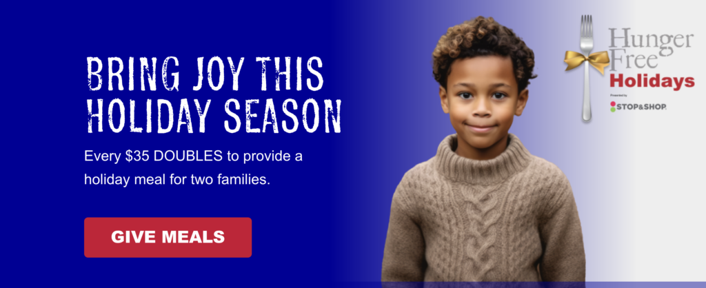
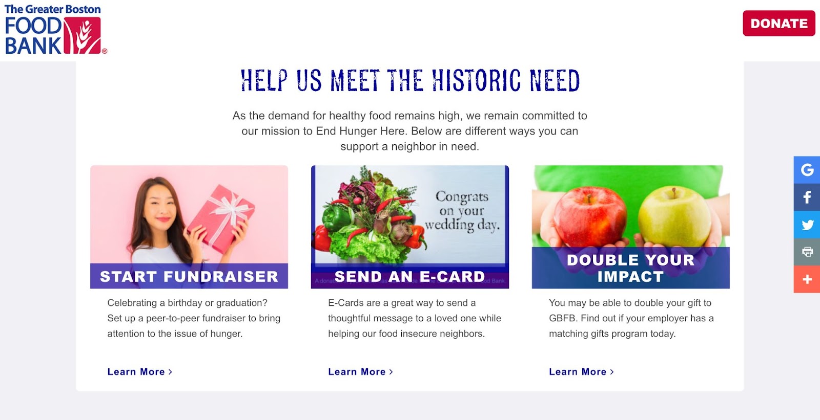
5. The Greater Boston Food Bank
The Greater Boston Food Bank pairs its love of helping a community in need with branding and language to match that sentiment.
Make an Impression
A soft color choice of purple opens the door to new visitors’ experiences on this website, paired with a visual of a young beneficiary demonstrating how critical the organization’s mission is. It also has a big red button with the call to “Give Meals,” inspiring immediate action.
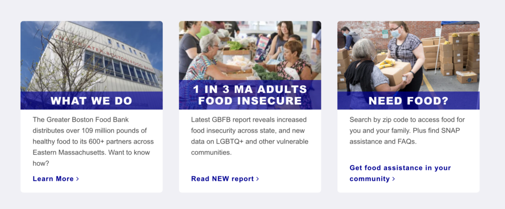
Tell the story
Once visitors begin scrolling, they can quickly see why this food bank has such an effect on the Boston area. The mission is clear, followed by design blocks designated to specific areas of impact that explain it one step further.
Provide a clear call to action
Thoughtful language continues to invite supporters to get involved in various ways based on their preferences. Visitors can take significant action with a peer-to-peer fundraiser on behalf of the organization or start with an e-card to kick-start their involvement.
6. Concern Worldwide
Concern Worldwide gets straight to the point by providing an above-the-funnel donation form paired with a quick, concise summary of how the organization works to end extreme poverty around the world. It does this with a user-friendly embedded donation form—here are some other examples of nonprofits using embedded giving methods to make donating easier.
Make an Impression
The background video playing automatically highlights poverty, disaster, and crisis. In less than 30 seconds, it communicates more than any blog post or photo album and provides visitors with a way to “rebuild and transform” these lives.
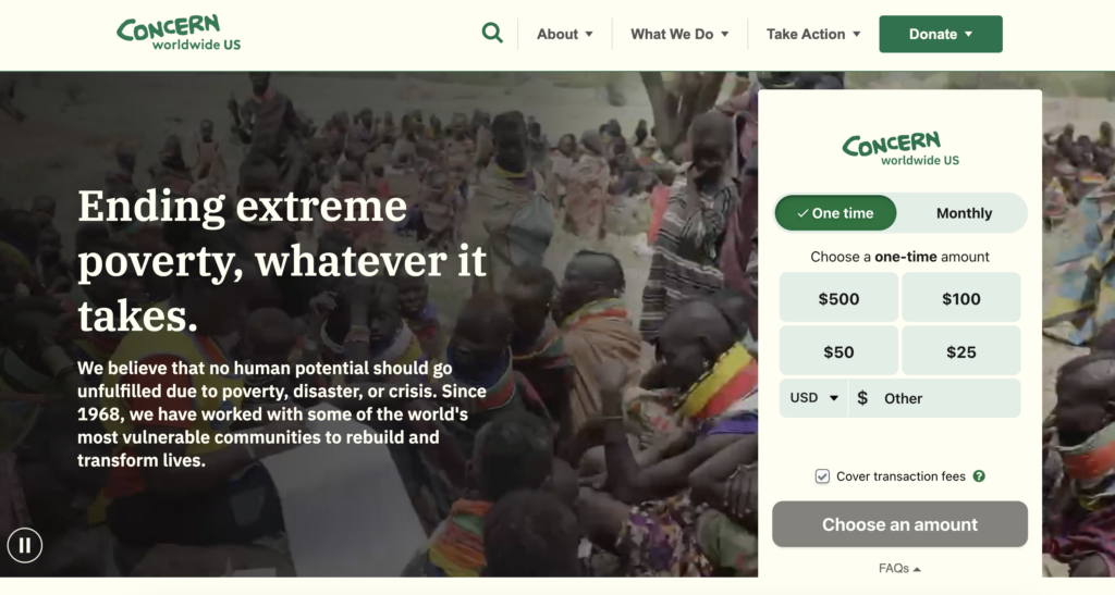
The section immediately below spotlights key statistics of the organization and links out to individual initiatives for visitors to learn more about causes that might interest them, such as education, climate change, and gender equality.

Tell the Story
Scroll down, and you’ll find the “Latest” section, which summarizes the most recent initiatives Concern Worldwide has launched, along with celebratory stories of the nonprofit’s success due to the generous support of its donors.

Provide a Clear Call to Action
The first call to action is unmistakable: “Donate.” Since it’s above the fold, users can’t miss it. It’s the highest priority CTA on the page, and that’s why it’s at the top. However, if users scroll down to the bottom of the page, Concern Worldwide provides visitors with other ways to take action:
- Fundraise for Concern
- Attend an event
- Partnership
- Humanitarian training

5 Quick Reminders for Your Top Nonprofit Website
Here are some final tips for nonprofits looking to create or reimagine new websites:
- Take advantage of website builders like WordPress that give you templates to build a dream website without coding or graphic design skills.
- Focus on search engine optimization (SEO) to bring new traffic to your website that already shares an interest in your work. Check out our coaching session to learn how you can optimize your website for visibility and conversions.
- Leverage a modern fundraising platform to help set up a donation page that matches the look and feel of your website with a donor-first experience.
- Bring your website design, videos, animations, images, and branding to life with tools like Canva for Nonprofits as you picture a fresh look to resonate with supporters.
- Make your website the hub of your nonprofit marketing approach to build a complete experience for donors.
Complete Your Website Experience with Classy
We hope these examples provide the design inspiration to offer new supporters a memorable experience, from first impression to transaction completion.
Classy’s fundraising tools complement your website and bring curious visitors to a donation experience that leaves them feeling connected to your cause. With mobile-optimized donation forms and modern embedded donation modals, you have the simplest way to convert website visitors into donors and advocates at your fingertips.
Explore how organizations like Feeding San Diego see a 44% conversion rate from a Classy embedded donation form and how to start seeing your results with a free demo.
Copy Editor: Ayanna Julien

Make Giving Easier with Embedded Giving
Subscribe to the Classy Blog
Get the latest fundraising tips, trends, and ideas in your inbox.
Thank you for subscribing
You signed up for emails from Classy

Request a demo
Learn how top nonprofits use Classy to power their fundraising.